
Big Daddy Cane
The Problem
A new and upcoming sugarcane drink store is in need of a website that fits the branding and design of its health-centric values.
The Solution
Create a design that approaches the brand with the simplicity and health forward values it associates with
About
Big Daddy Canes is a sugarcane drink store that focuses on modern aesthetics and an alternative provider to a more health conscious yet delicious product.
Tools
Adobe XD
Figma
Miro
Invision
Wix
Key Features
Before starting to ideate the design process, I wanted to conceptualize certain features and design choices that would cohesively bridge the gap between user and brand. Focusing in on three primary values:
1. Brand Transparency: Being a health centered brand, it is important to show users and customers an inside look on what is being put into their bodies.
2. Ease of Access: Health should be accessible to everyone, so a simple and approachable design was necessary to allow a broader audience.
3. Modernity: A modern design approach for a modern approach to healthier food and beverage alternatives.
Listen To The People
To supplement a strong foundation of how to move forward with this design, I wanted to speak with potential users/customers on some of the pain points or key benefits they may have had with similar services or brands.
"It's hard to trust health conscious brands that don't seem fully transparent with what goes into their products."

"Some websites are too cluttered and hard to navigate, so I appreciate the brands that take the time to make it easier."
Who To Design For?
The next step I took with all the given information, was creating a user persona. This would help bring cohesion between all the various information and data collected and direct the design to move in a way that has both the brand and user in mind. This was an important process to help combine all the different thoughts and opinions of potential users into a model that I could work with.
.png)
Miranda became the eclectic representation of all the wants and needs of the potential customer base for the brand. Many food/beverages brand are driven through their branding and style, with the focus of well-being evolving every year. The user persona dives into the motivations and different personality types that would be suited for our brand and helps decision making in stylistic preferences and accessibility more efficient.
Style Tile
To make the design process easier, and for the brand to have a template to make any necessary future changes, I created a style tile that reflects the various aspects needed to build the brand website.

I wanted to keep it very simple and clean. With a minimal approach to typography and iconography and simple hover states of buttons. I chose a bright yet muted color palette so that colors would pop but wouldn't be too harsh on those trying to navigate the website.
Desktop Wireframe
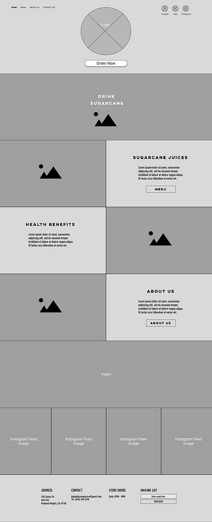

New Life

The wireframing process for the desktop version was kept simple and supported by multiple images and large easy to read text. Even the menu portion was created to keep ease of access at the front of our design.
Desktop Mock Up


Presenting the final design for Big Daddy Cane! This design came together to provide all the necessary information readily available at the users fingertips. On the homepage, ordering, learning more about the brand, and browsing the menu are all available so that any range of users can get to exactly where they need to on the site.
Can't Forget About Mobile
%20-%20Homepage.png)
%20-%20Our%20Drinks-1.png)
%20-%20Homepage%20(pt_2).png)
%20-%20Homepage%20(pt_2).png)
%20-%20Our%20Drinks.png)
Accessibility is important! That's why creating a mobile version that followed the same formula for the desktop version was vital in creating cohesion through the brand and its message.
%20-%20Homepage.png)
%20-%20Homepage%20(pt_2).png)
%20-%20Homepage%20(pt_2)-1.png)
%20-%20Our%20Drinks-1.png)
%20-%20Our%20Drinks.png)
Future Focus
.png)
The future focus of this brand should be in highlighting the various products that they are coming up with and producing. Nutritional facts should also be incorporated for ultimate brand transparency and establishing that information on the website so that consumers can be aware of this information before coming in to try the product.